[CLOSED BOUNTY] : Articles about Colour Perception

Earn 100$ equivalent in NEAR by writing an article of 1000 words about colour experience/perception. It could be 1st person experiential account with research references, a summary of a book or a research paper is also a possibility here.

These articles are being commissioned to develop a research archive that might potentially help artists/developers working with VR or Visual Arts in general.

This bounty is for 5 articles and each article is subject to approval from the VR council.

Submissions are open until 5 qualifying articles are submitted so if this bounty is online submissions are open.

Please familiarize yourself with the research landscape if you arenā€™t and choose a specific issue to discuss if it is easier.

This rather vintage BBC documentary : https://www.dailymotion.com/video/x7myq5z

and colour scientist Prof Stephen Westlandā€™s blog are a good place to start : http://colourware.org/

The BBC has done a more recent series on colour which you might find on netflix or other platforms. We also recommend you see them if possible

The language needs to be of publication calibre in a research blog.

If you are reading this thank you very much for your interest and engagement.

You can reply in this forum with the article you wrote. Council members [ @frnvpr @microchipgnu @Natural-Warp @JulianaM @Samiasns, @squattingPigeon, @nearestchico and @nico] regularly check this forum and will advertise the selected articles once they have 10 of them. If your article qualifies you can then head to SputnikDAO to ask for your payout.

Any questions regarding this Bounty or any other questions, feel free to ask, either by replying to this topic or by talking with the community in our TG channel: Telegram: Contact @vrdao

SUBMISSIONS WILL BE REVIEWED QUARTERLY AND REWARDED AT THE END OF EVERY QUARTER. THE NEXT REVIEW IS DUE FOR END NOVEMBER.

:note: in light of the recent changes in the funding structure, the value attributed to the [approved] payouts was changed.

Contacts and useful links:

Our TG channel is open to everyone who wants to engage with us and explore new VR related projects and ideas. Meet us on TG Telegram: Contact @vrdao, Instagram Login ā€¢ Instagram and twitter https://twitter.com/dao_VR.

Everyone can also check what we are currently working on, just follow this link: vr-dao open doc - Google Docs ; for the moment, only council members can edit, but feel free to comment.

Find also Microchipgnus project 3XR on twitter https://twitter.com/threexr_ and discord Discord .

9 Likes

Would love to participate & will do my best to deliver an article, maybe picking up the previous ideation or with a reference to some previously done research. Will keep you posted :slight_smile:

5 Likes

Thanks @tabear for your interest! Weā€™ll be happy to receive your article. Once itā€™s ready please send it to us :blush:

2 Likes

Hi? Iā€™m almost done with my article. I will send it once Iā€™m done. Itā€™s a research paper I created today with a mix of my personal experience and citations from other publications which would be referenced for further guide.

2 Likes

hello oblak, welcome! Curious to see what you ll write!

1 Like

I can act as a bit of a sounding board here, Iā€™ve been a professional artist for 15 years now :stuck_out_tongue: I would hope Iā€™m good at this. If you guys have questions, or maybe things you might want to test, let me know

1 Like

I would like to write a book review of Jeff Davisā€™ Foundation of Color.

2 Likes

Thanks Kurtis, your engagement with the material will be much appreciated!

2 Likes

Look forward to reading your review @giada42! It looks like a practical book that might be useful to a wide range of practitioners.

1 Like

Hi? My article is ready. Do I post it here or is there an email I can send it to?

2 Likes

yes you can post it here, we will review it and selected articles will be published somewhere to be confirmed soon.

2 Likes

Alright. Iā€™ll post it

2 Likes

so much activity already! excited to read all these articles :smiley:

1 Like

@squattingPigeon It seems I lent someone my copy of ā€œFoundations of Colorā€ and would not be able to get it back soon. May I review a different book on color instead?

1 Like

The content of the article is entirely your decision as long as it is addressing the bounty so of course feel free to do so!

1 Like

Author: Oblak
Processing: ARTICLE ON COLOUR EXPERIENCE -OBLAK.pdfā€¦

Title: COLOUR EXPERIENCE/PERCEPTION, (A PERSONAL EXPERIENCE & SUMMARY OF RESEARCH PUBLICATIONS)

DATE: 02/09/2021

PURPOSE: RESEARCH DOCUMENT FOR ARTISTS/DEVELOPERS WORKING WITH VISUAL ART

Colours play very important roles in our everyday lives which could range from identifying and differentiating objects, to how we describe people and also having direct impact in our lives due to one or more previous experience(s). Have you ever wondered if we see colours the same way? Are you really convinced we see the same colours just as it is? Or can my blue be your purple? How does colour affect a personā€™s mood? Do we all associate red color with danger or black as evil? Since time immemorial, colours have been a very important part of our lives and have influenced generally the way we see or perceive people and objects. Colours can also represent our moods and how we feel towards a particular situation. For example, I feel more comfortable putting on dark coloured clothes or those with darker and dull shades which explains why I am introverted in nature unlike extremely flashy colours such as yellow, white, lemon which are bound to draw attention in public. Visual artists attach a whole lot of importance to colours which enables them create a piece where the colour(s) used will blend with the actual images to create a sense of meaning to the art work.

Colours play a major role in helping us make meaning of our immediate environment. This curiosity made me stumble upon several research publications that answered my questions.

Going through one of his publications titled, ā€˜Do different people see the same colours?ā€™, Jabulani Sikhakhane opined that the brain plays a major role in determining how different people see colours and after carefully reading through, I agreed with the authors point of view where he argued that our brain also see just like our eyes would. He continued further by stating thus;ā€ We say we see different colours because of how our brains learn to link the signals they get from the eyes with the names of different coloursā€. He also cited an example of when a baby points at a ball and her father asks, ā€œwould you like to play with that green ball?ā€, she learns to associate the colour sheā€™s seeing with the word ā€œgreenā€, and she will soon call things of a similar colour ā€œgreenā€ as well.

Going further with my research, I observed that our tendency to identify colours is directionally proportional to the amount of light or illumination that enters our eyes which helps us interpret these colours to make more sense of the image and I decided to find out.

I went strolling with a friend and we sat down at the center of a field close by. While we chatted, I noticed the sky was much more colourful than usual. I admired how different shades of blue were circled around each other and in a bid to express my satisfaction with what I considered a perfect piece of art, I asked James to tell me what colours he could find in the sky and he mentioned royal blue with white but I saw a lighter shade of blue and orange. I needed to know if truly we see colours just the same way or they appear the same way upon sight but differently in our inner eye?

I continued my research on how colours affects our perception and how they describe an artistā€™s work and also if these colours can truly connect with our reality. I can state that the importance of colours in representing or explaining a piece of artwork cannot be over emphasized as it gives meaning to every form of visual art. The use of colours to represent a scene helps art collectors select the best piece that directly represents how they feel about a particular subject or someone as the case may be.

Colours can be represented in different forms to produce a finished artwork which must agree with the situation being explained therein. Take for instance, an artist who wants to make a painting that has an agricultural theme or of farmers working out in the farm, it is very much important to consider the use of colours that represents agriculture or earth which easily would be all shades of green. The reason is because the lens in our eyes has adopted green as the primary colour representing nature and earth thereby creating a sense of reality in that artwork.

COLOUR AS SYMBOL

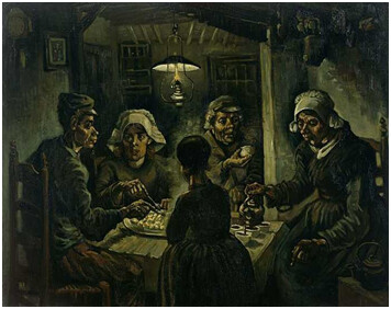
Going further, I stumbled upon an artwork created in 1885 by Vincent Van Gogh titled, ā€˜The Potato Eatersā€™ which he created by using oil on canvas. The image below describes a peasant family who are dependent on agriculture and land for survival. I admire the earthy green and brown colours he used in this piece which truly defined and added meaning to it. The essence of this was to connect reality with our imaginations by just sighting the art work.
image

VINCENT VAN GOGH

The Potato Eaters, 1885 (oil on canvas)

COLOUR AS MOOD

I stumbled upon another piece of art by Pablo Picasso where he used blue to express his emotions in one of his most popular piece titled, ā€˜The Old Guitaristā€™. This artwork was inspired by the loss of his closest friend which led to his depression and decided to make a painting representing his mood. The painting was of an old man with twisted legs and a sad face holding on to a brown guitar with sad tones overwhelming the ambiance indicating the torments he was going through at that time. Blue signifies sadness and coolness which perfectly describes the reason behind its use. Understanding the use of colours to describe a situation has continued to give meaning to art and its collectors.

CONCLUSION

Colours are very important aspect of our lives and helps in the organization of events and people. The concept of colour is far more complicated than we think and the moment we begin to truly understand how colours are applicable in our everyday lives, and then we can begin to make more and better informed decisions which will be represented in our art.

REFERENCES

Valich L. (2018). The science of seeing art and colour; University of Rochester, Monroa County, New York.

Straford T. (2012). Do we all see the same colours? ā€˜Science of what is happening in your brainā€™.

Google Incā€¦ (2016). In Encyclopedia Britannica.

Retrieved from https://www.britannica.com/science/colour/The-perception- of-colour

2 Likes

I just came across this bounty and was wondering if I could submit mine or wait till next time.
I will just write outrightly I got no article published anywhere I go with reality or what I can fiction ideas

1 Like

hello! This Bounty is still open. Anyone can submit, still. :wink:

1 Like

Awesome! I will put together some ideas and submit

1 Like

Writer: Purpledot

DATE/8th/September/2021

Article; Colour Experience/perception.

Purpose/Target ;
To air personal view and perception of colours and educate.

What is colour?

Color or colour is the visual perceptual property corresponding in humans to the categories called red, blue, yellow, green, purple, white etc. Color derives from the spectrum of light interacting in the eye with the spectral sensitivities of the light receptors.

You can all agree with me that colour is a major part in human and the entire universe !
For sure, thatā€™s because not a thing is colorless! Weather skin or non entity alike. This brings to the understanding of my existence that took me into findings about different colors and what they could possibly pose. Which now imbibed that color could imply different things to different persons based on their mood and sense of knowledge. It could tell a persons ideology or personalityā€¦

Vision is obviously involved in the perception of colour. A person can see in dim light, however, without being able to distinguish colours. Only when more light is present do colours appear. Light of some critical intensity, therefore, is also necessary for colour perception. Finally, the manner in which the brain responds to visual stimuli must also be considered. Even under identical conditions, the same object may appear red to one observer and orange to another. Clearly, the perception of colour depends on vision, light, and individual interpretation, and an understanding of colour involves many deep meaning.

The three additive primary colours are red, green, and blue; this means that, by additively mixing the colours red, green, and blue in varying amounts, almost all other colours can be produced, and, when the three primaries are added together in equal amounts, white is produced.

Colour can can be of great importance and use to artists, it can help in telling their story more and in the choice of color of an artist one can easily relate to the message being passed and that will enable for more details on the very article.

    CONCLUSION 

ā€¢ Different colors evoke different emotions: yes! Thatā€™s the reason you see people favorite red as stands for love and wonder why itā€™s also used for danger?

ā€¢ Youā€™re more likely to forget something when itā€™s in black and white: well, thatā€™s a fact.

ā€¢ Men and women see colors differently: that can be also dependent on how certain beliefs of men and women differ.
ā€¢ Blue is the worldā€™s favorite color.

1 Like